Client: DesignAlly (Logo & Branding)
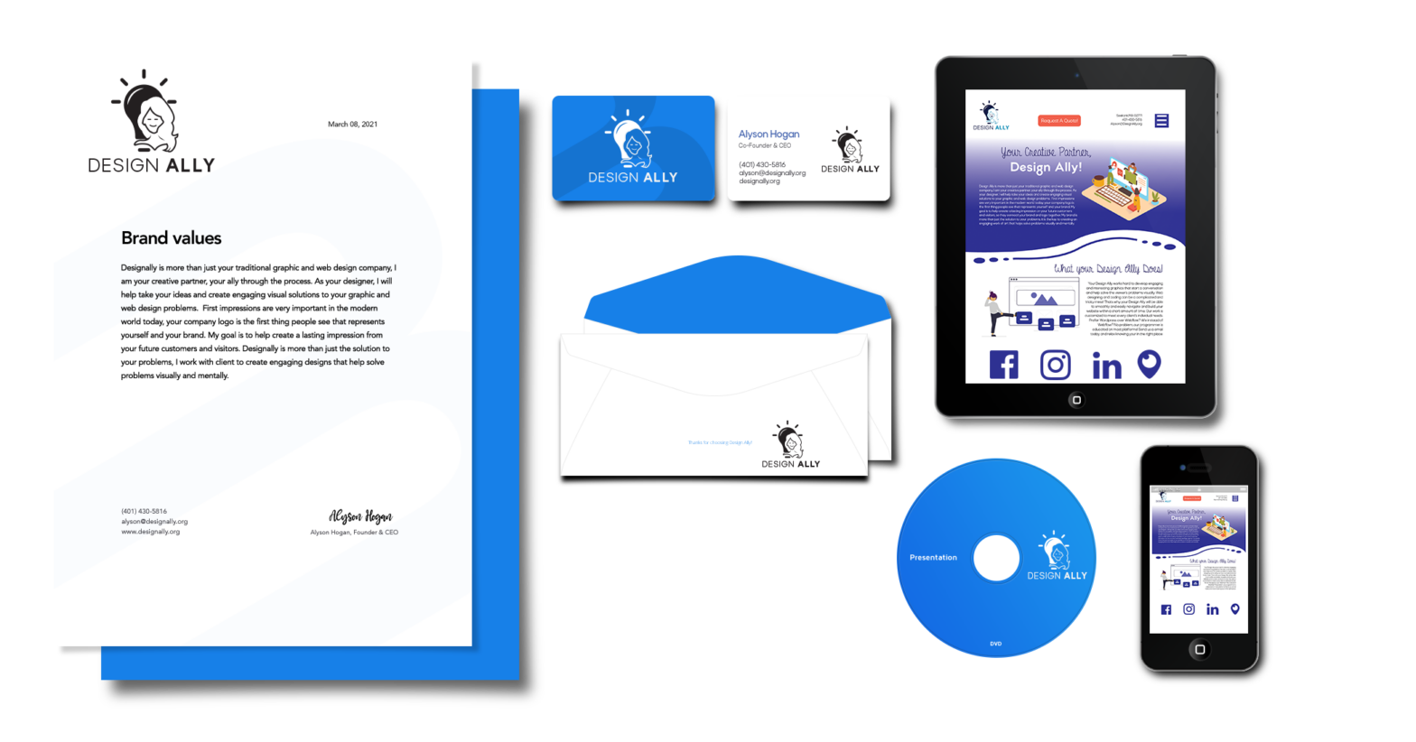
DesignAlly is more than just your traditional graphic and web design company, I am your creative partner, your ally through the process. As your designer, I will help take your ideas and create engaging visual solutions to your graphic and web design problems. First impressions are very important in the modern world today, your company logo is the first thing people see that represents yourself and your brand. My goal is to help create a lasting impression on your future customers and visitors, so they connect your brand and logo together. My brand is more than just the solution to your problems, it is the key to creating an engaging work of art that helps solve problems visually and mentally.
The reasoning behind the brand name, Design Ally, is because when you create something, from business cards to huge wall-size banners, our brand takes the complex and stressful parts of the project and simplifies it for our clients. Our brand follows a timeline that works best when our designer works together with the client, so the client has a clear understanding of the graphics and work that is being done on the project. Our client’s can feel at ease knowing that from the moment our company takes on a new client or project, they have made the right choice.


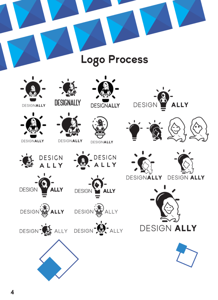
I wanted the logo to represent how the relationship between a graphic designer and how they can be your supportive creative partner, or ally that is working together to create visual solutions. One of the reasons I decided to use the light bulb is because I want people to see the icon and immediately know that it stands for Design Ally and is not misinterpreted.
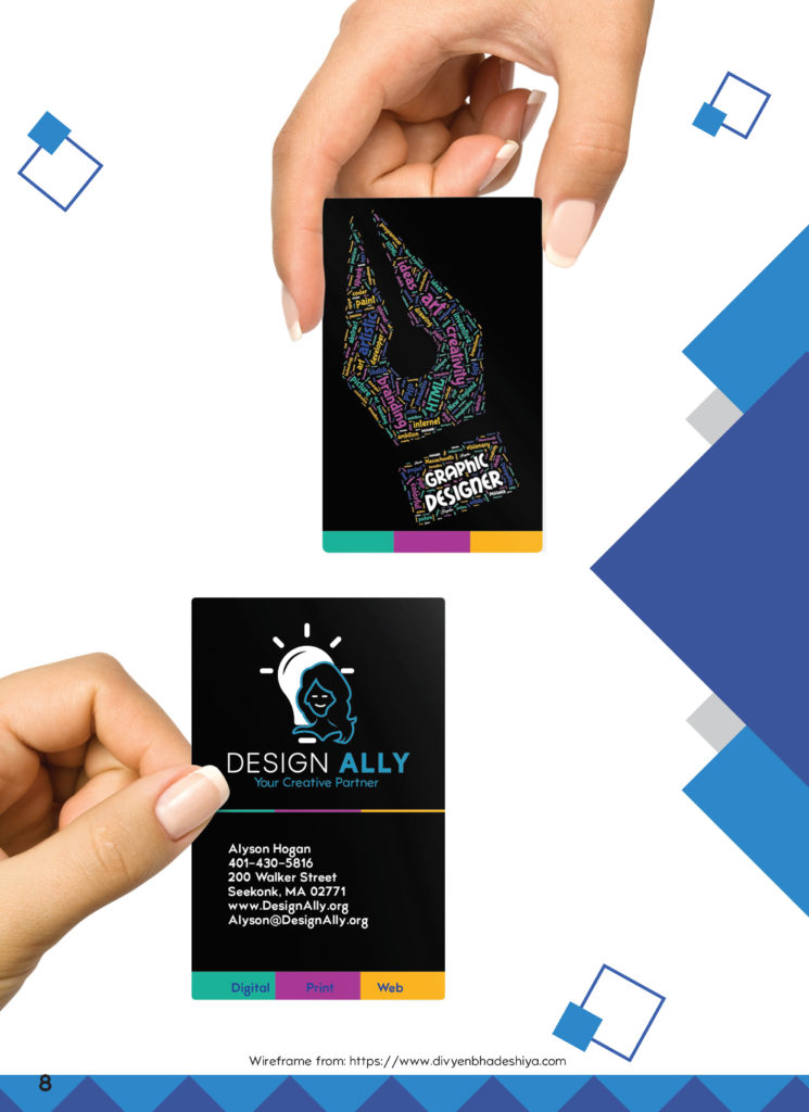
I also wanted the logo to have some personal touches that represent myself. For example, I decided that using the same base color, in different shades and tints would work best to show a visual hierarchy in my logo design. I choose to use blue because blue is an extremely powerful color. It represents trust, power, and professionalism. These traits are important to my brand because my customers should trust that the designs and website artwork I create for them will have a professional and powerful visual message.

